I have a sliding UI experience that is built within a scroll collection and has multiple levels the user can navigate between. Outside that scroll collection is a stationary up arrow button that lets the user slide up to the previous “frame” of the scroll collection. The script on this button just scrolls the y by -1920. Pretty simple and works great. It’s nice because this up arrow button just stays stationary as the content next to it scrolls vertically which is what I want.
Problem is when it gets back to the home screen/frame of the scroll collection, I need this up arrow button to turn off. If this were flash I know you could basically do an if/else statement where it says if x movieclip is in y position, turn z button off. Is something like that possible in here?
I do know how to make this work the messy way in intuiface where that up arrow button is WITHIN the scroll collection, and there’s multiple copies of it for each level of the experience, but that’s not quite as elegant design wise as I want it.
Long story short, you have basically answered your own question here, you can create a IF statement as to when
equals X and Y position hide “Button” and then do the opposite for showing the button when not in the home screen.
I hope this helps, it’s probably worth looking at the conditional triggers within the knowledge base.
So I actually just figured out how to do it before I saw your response. On the first frame of the scroll collection, I can put a trigger that says when this frame is moved into viewport, hide arrow button. Works great.
Another unrelated question. See this wheel graphic to the right? What is the best way to make that interactive in intuiface. Doing each arrow as its own png image doesnt seem that efficient. Is there a way to pull the wheel in as 1 graphic, and add hotspots to each arrow to then pull up
One thing to remember is that sensitive zones of image buttons are rectangular shapes. When exporting each arrow as a PNG to build your transparent buttons, you may have some overlap.
A way to avoid this is to indeed export your graphic as a single image, then add transparent buttons (or toggle buttons, if needed), on top of your main graphic. Each button will then show/hide the proper feedback using trigger & actions.
Ok so say I do the entire wheel graphic as white arrow panels (except the start panel), and import a purple version of each arrow panel, what would be the best way to handle turning the arrows on and off when the user taps?
I know I can do it the long way and on each white arrow have a bunch of triggers that turn all other purple arrows off, but that seems cumbersome. Is there an easier/cleaner way?
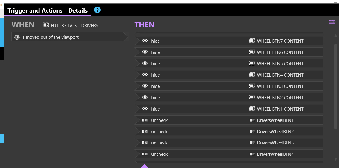
Is there a way to clean up these triggers? I have a lot because of this interactive section, so when this frame of the scroll collection moves out of view, I have to reset everything on that wheel you saw above.
More questions lol. I’m working on a big important project.
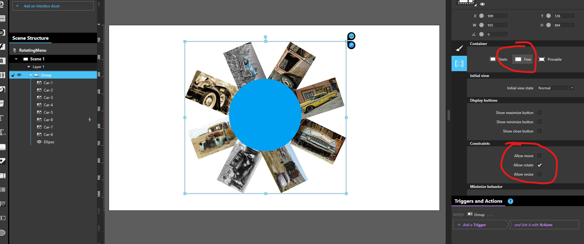
In this one I have this target looking graphic. I want each colored ring of it clickable. Is that possible? Maybe have 3 circular buttons if thats possible and stack them?
About “cleaning the triggers”, I’m not sure what you’re looking for, but here are 2 things that may help you to reduce the number of actions in this panel
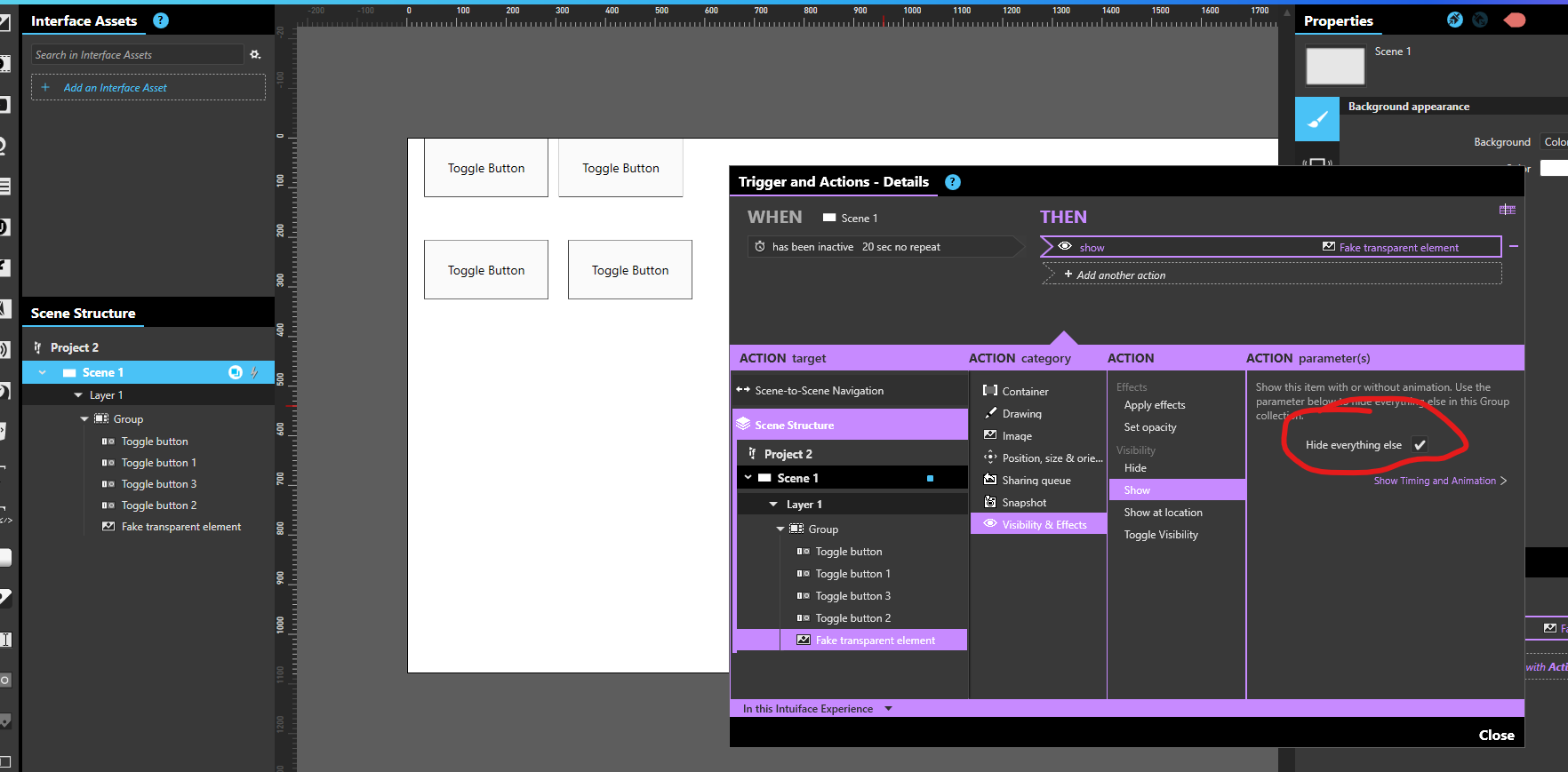
if you need to “hide all elements but one” in a “group”, you can call the Show action on that last element and check the “hide everything else” option. It will hide all elements belonging to the same parent, ex: a Group collection. You can use a fake transparent element or a light object like a text outside of your group as this item to show.
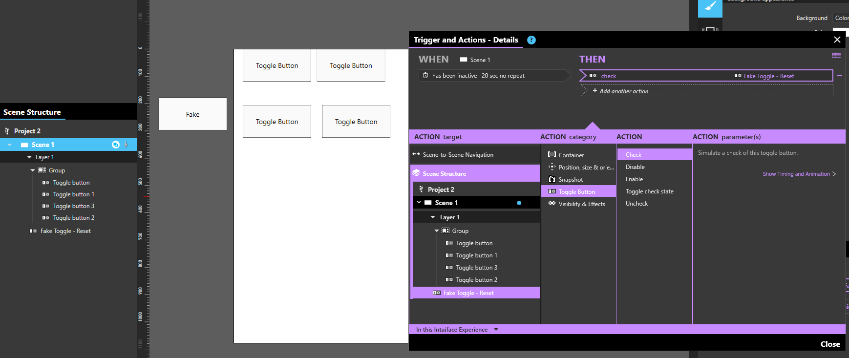
A similar mechanism is available with toggle buttons. To uncheck a large number of toggle buttons, add a fake one, invisible, and make sure they all belong to the same toggle set. You can call the “check” action on this fake button, it will uncheck all the other ones belonging to the same set.
Use SVG through an HTML Frame as explained in the same article, but further down in the posts: Irregular shaped clickable object - #25 by Joshua (link should go to the US map buttons). This one is a bit more technical to retrieve the clicks as triggers in the experience, but gives you the most flexible design.
Great thanks Seb. Ok another question. I have a scroll collection with 6 images in it, all laid out horizontally. Only 1 image is seen at a time.
I have a trigger on the scroll collection itself that says on tap, scroll the collection x pixels, which works fine. Each image comes into view the way I want and the others are outside of view. Problem is when it gets to the 6th image, the next time the user taps, I need to have it scroll all the way back to the 1st image. I cant figure out how to do that.
On to the next question. How do I get this circular collection so the user can use their finger to rotate it? I have some placeholder images in there for now thst they can tap on to learn more, but it wont rotate.
I see on this page a lot of options under container behavior, but I dont see most of this in the container behaviors for any of my objects. All I have is resize, no resize, and scale. Im still trying to figure how to make an image freely rotatable by the user. Cant seem to do it with a circular collection.
