No other analytics tools for interactive applications in the market can allow you to so conveniently and strategically define, collect, visualize, and share the performance data the way Intuiface Analytics does. We are pretty proud of it. But that is not to say Intuiface Analytics is perfect. If we were to believe anything we achieve is perfect, we’d have no more work to do.
So here’s another example of how we give up on being perfect for making a continuous improvement - NEW FEATURES FOR INTUIFACE ANALYTICS! - We are excited to announce Gauge Chart .
Here’s how it works
- Gauge Formatting (appears if Gauge chart is selected)
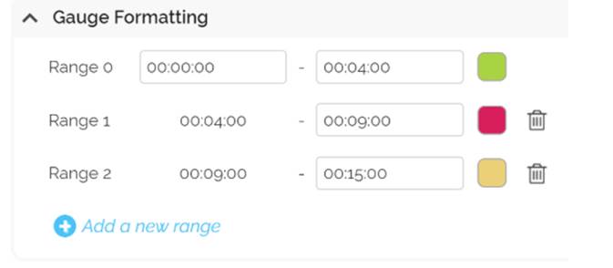
- Range : Specify one or more ranges, each comprised of a minimum and maximum value. A Gauge chart must have at least one range; any number of ranges are possible. Select a color for each range.
- Range : Specify one or more ranges, each comprised of a minimum and maximum value. A Gauge chart must have at least one range; any number of ranges are possible. Select a color for each range.
- Gauge Style (appears if Gauge chart is selected)
- Gauge width : Specify the thickness of the gauge
- Start angle : (for Gauge - Arc) Specify where on a 360° circle the Gauge chart should begin. Values range from -360 to +360. Gauges are always drawn in a clockwise direction
- End angle : (for Gauge - Arc) Specify where on a 360° circle the Gauge chart should end. Values range from -360 to +360. Gauges are always drawn in a clockwise direction.
- Orientation : ( for Gauge - Linear and Linear with Scale ) Specify whether the gauge should be horizontal or vertical. If deselected, the Gauge chart will be horizontally oriented.
- Font size : Font size for the representation of the actual value identified in the Gauge. Font and Font Weight are specified in the Chart Customization section below the chart.