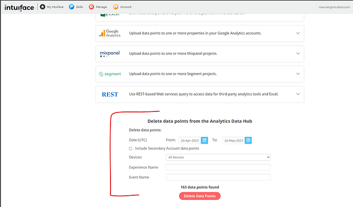
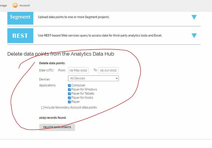
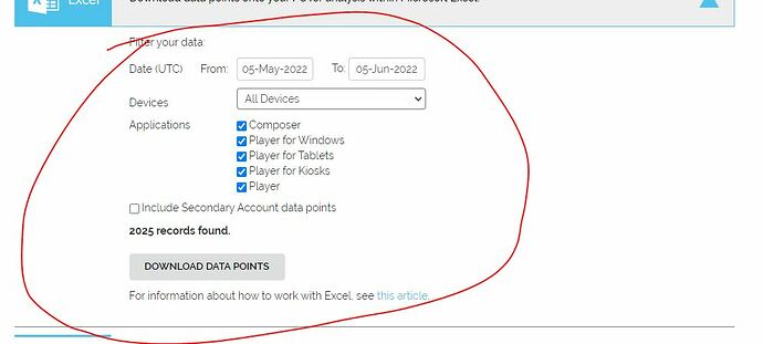
The aesthetic and structural part of the delete data point is practically the same as the look for you to download the data points.
I know that textually it says “delete” and after you click on the button it confirms asking if you want to delete it, but I will tell you in the user view, going into “automatic mode” myself and my team, accidentally deleted more than one time all the data from my “Analytics Data” without realizing it, thinking we were downloading the data.
It would be interesting for your team to visually change the area where you will delete the data, or place them inside an expandable container as is done with the other options, in which the person is obliged to read the option, click to expand the field and then delete it.
Like me and my team, more people must have unintentionally (accidentally) deleted information thinking they were downloading.
Knowing this, I believe we should try to prevent this error from happening. I know it’s written and it still has confirmation, but we also know how the human being works, when he goes into “automatic mode”, so we create artifices to avoid the error / problem.
In my case, both times accidentally deleted the data, it were test data and it wasn’t important, but imagine if it was precious and important data?
Hi @renan,
Thank you for your feedback, I’ll make sure this is passed to our product team for review.
In the meantime for the other readers out in the community, this is the screens we are talking about here.
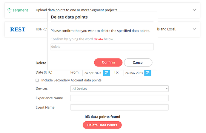
After hitting the Delete Data Points red button, you get this confirmation pop-up where you have to explicitly write down the word “delete” to actually delete your data.
I do understand what you mean by “automatic mode”, especially if I’m doing such a thing before my morning (first) coffee, but I honestly can’t think of a scenario where I would voluntarily type the word “delete” using my keyboard to not delete some data.
I’m not sure how much more explicit this confirmation pop-up would have to be.
Do you have any suggestions on that part?
Seb
Thank you for your reply Seb.
From what I saw in your images, now you have this popup that you are forced to type delete. The way it is now, really even if the person accidentally clicks on delete, he will be forced to type DELETE in the popup and he certainly won’t do it accidentally and automatically.
When it happened here with me and the team, it were different. Visually it was similar and the confirmation was a normal button that you can accidentally confirm on automatic, as happened to me and also to my team.
The way is now is better! ![]() If we accidentally clicks on the first screen, we will definitely pay attention to the pop-up and will not delete data accidentally.
If we accidentally clicks on the first screen, we will definitely pay attention to the pop-up and will not delete data accidentally. ![]()


