Hello All,
First post! I just wanted to quickly share my progress on a little code I threw together - before I meet with the team here in Chicago, tomorrow.
To try and familiarize myself with the platform, I figured I would create a small, fun project. After playing around with the API explorer, I started thinking about all the interesting data out there and how I could visualize it.
I found an amazing data science post where the author discusses how he accessed the NBA statistics feed, transformed the data with pandas (+ other tools) and how, he used a open source charting library, Plotly, to visualize game data. His interactive visualization are amazing and reminded me of the author, Edward Tufte’s concept of sparklines.
Here is the post:
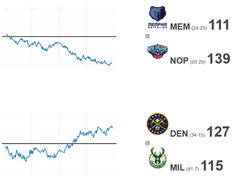
In an attempt to try and build some kind of interface asset, I threw together the following quick prototype. I guess I fell back to old habits because, I spent most of my time in JavaScript tweaking the chart parameters to get them to look the way I envisioned.
While I had hoped to integrate this further with my Intuiface project, I feel that this was a good first step. Hopefully, I can discuss some strategies about how this could be integrated and enhanced within an Intuiface project, with the team tomorrow.
Looking forward to meeting everyone!
–Josh