Creating experiences for more than one display resolution

Has anyone created experiences with more than one display resolution, or converted an experience from one display resolution to another? If so, what pointers or tips do you have for making this process a little smoother?

I’ve got to convert an experience I’ve created for iPad to run on a PC at 1080p, and I’m trying to avoid a complete rebuild ‘from the ground up’ if I can help it. Thanks!

After making four separate attempts to convert an experience from one display resolution to another, I have determined that it will not work.

Every test I’ve done in Play Mode yields sporadic and unpredictable results. Items in scenes will randomly not show up. During the same session moving forward and backward through the scenes, there is no predictable pattern of when assets will appear and when they won’t.

I do not recommend taking on projects that require experiences to be in more than one version at different display resolutions, unless you’ve got the time to build each experience independently from scratch.

Yeah, changing resolutions CAN be a pain. If a client asks for it specifically, we add that into the cost of the project. GOOD LUCK!! :tada: I’ve found that, just like when I’m rotoscoping something in After Effects, it helps to put on some good music with a fast beat to get through all the tediousness. :wink:

1 Like

Absolutely! We did bill for this ahead of time, but the content is a questionnaire that meanders through various questions to arrive at one of 28 possible end screens. It works well on the iPad, but as soon as I change the display resolution and test the experience, it stops functioning normally after the second scene. There’s no way I can rebuild it all in 4 days since it took a week and a half to build.

1 Like

I’m rooting for you!! Hopefully it won’t take as long as you’ve built the elements, and have triggers. It’ll just be redoing the triggers, which can be tedious. But hey! It means job security, right?

2 Likes

Can you share a video so we could possible help.

2 Likes

I would, but I am working on 2 other projects at the moment that are both due at the end of next week. Maybe I can pull one together in November. Thank you for your replies thus far, I really do appreciate it.

1 Like

Thanks, but this thing’s got more triggers than an armory and a gun factory put together.

1 Like

@cullenb

I don’t mind a challenge :wink:

2 Likes

I’m just going to knock down the price a tad and hope they don’t mind a little letterboxing. :wink:

Being able to have the canvas resize from the center out would actually fix everything right now, but I don’t expect the developers to drop everything in order to revise one feature.

I have fiddled with the idea of creating the base structure of the experience as a web component, using responsive css techniques to create the desktop, tablet, mobile views and populate the scenes with the various content stripped of wrapping elements. Not altogether successful but in principle the idea should work, I just don´t have time to do it.

1 Like

That sounds promising, but yes, time is the elusive element here. I’d rebuild the experience for 1080p on PC if time allowed, but this is not feasible. I have come up with a workaround that’s not too much of a compromise, though.

I’ve saved a separate version of the iPad experience (which is still 2048 x 1536), deleted all background images, and made all of the scenes and the experience itself have a transparent background. I then made a new version of the background (and having an unchanging background is key here) at 1080p and made it the desktop background in Windows 10 for the PC. Removing the desktop icons and recycling bin is necessary to pull this off, as well as disabling edge swipe. It’s not perfect, but it looks pretty good.

1 Like

Yes, I have a “trick” for you here which I used for our Intuiface Presentation.

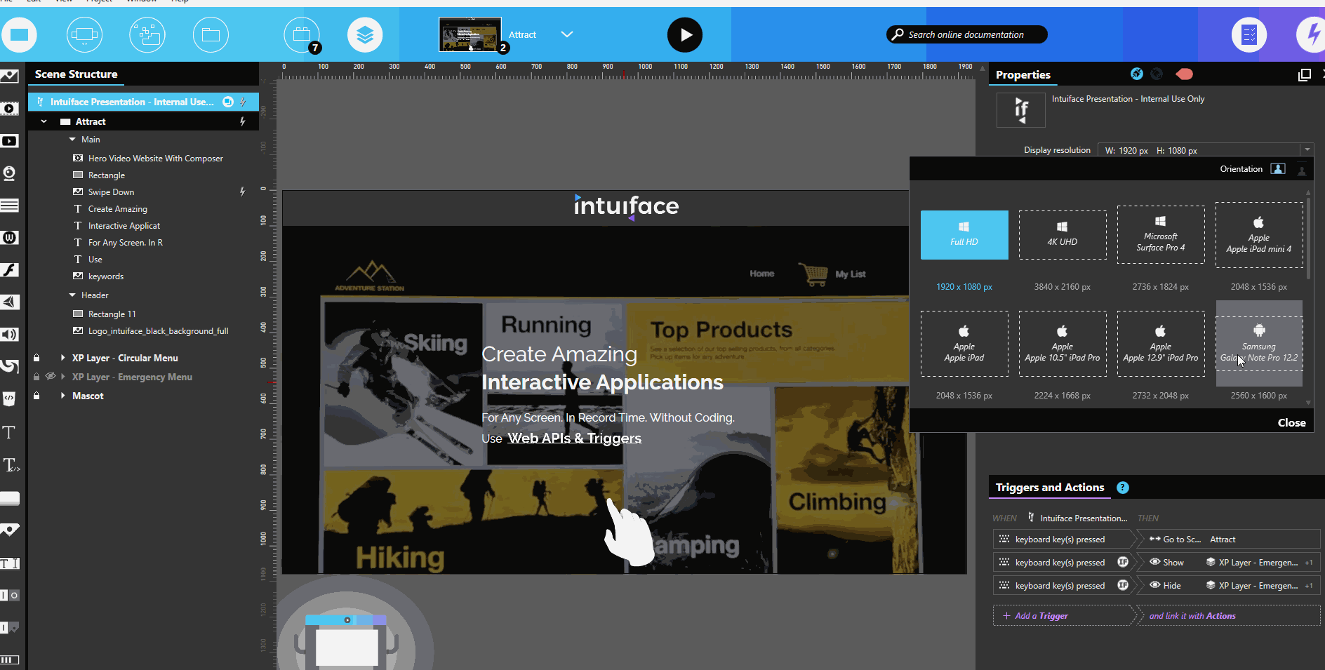
  1. Design the experience in Full HD 1920 x 1080
  2. Use it both on Windows & iPad for your development process & tests, with the black borders on iPad
  3. When fully tested, make a copy of the experience and resize it to 1920 x 1440. This is a 4:3 ratio used by the ipad and Player will automatically make the experience fit to the screen.
  4. You just have to “stretch the content vertically” to make it fit the new scene size.

resizeXP

2 Likes

Nice! I will definitely try that next time. Do you have to “retrigger” based on new coordinates for moving assets?

It depends on the objects your are moving, but most likely, yes.

Gotcha. And the HD images at Retina resolution weren’t noticeably aliased (pixelated)?

Not on an iPad pro we use on our booth during trade shows.

The same principle can be applied in the other way, if you need a better resolution on iPad. Design in the “higher resolution” first, then downsize only 1 dimension (the height) to fit the 2nd ratio.

2 Likes

That’s great; thank you for the pro tip!

2 Likes